A DESIGNER IN THE PRINTER’S DEN
In this blog series, the creative director of our sister company, Blackbuck Marketing, gives us an insider’s view of what a graphic designer can learn working inside a printing company.
It’s the most wonderful time of the year, and that means that every non-profit is gearing up to mail out their end-of-year appeal letters. If you’re a designer, you may have worked on several of these pieces in the last month or two.
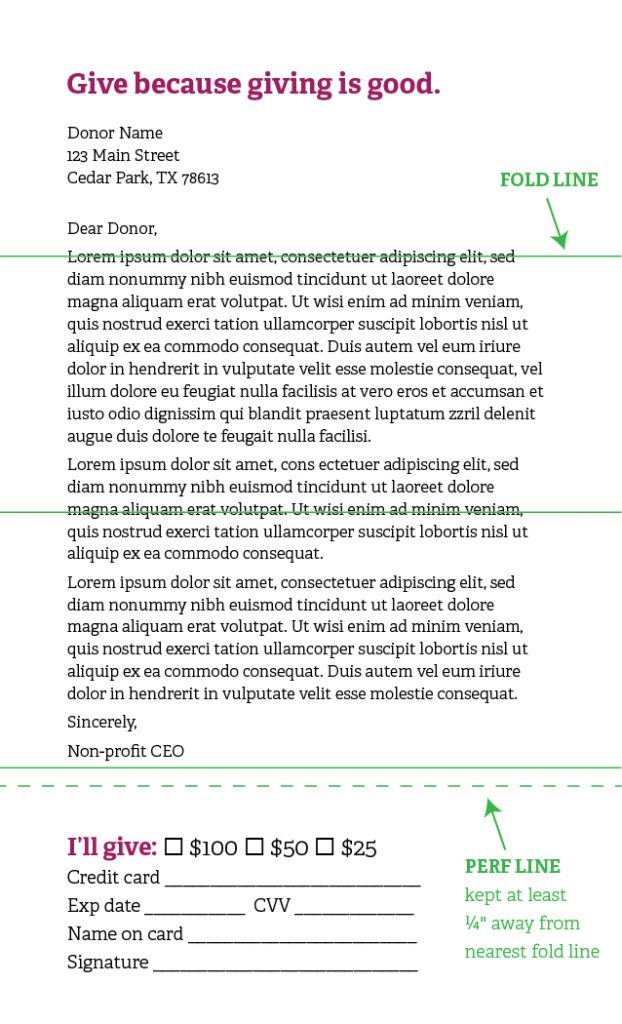
You’ve probably seen the standard format these letters take: an 8.5 x 14″ sheet with a section at the bottom that perforates off. The donor fills out that bottom section with their pledge information, tears it off, and mails it back in the enclosed, self-addressed envelope.
So here’s my tip for you today: when you’re designing this kind of appeal – or any piece that has both folds and perforation on it – don’t have a fold line overlap with a perforation line. In fact, you want to leave at least 1/4 inch between any fold and perf, as shown below.

Why leave that 1/4-inch space? Because no matter whether those folds are done by machine or by hand, folding along or near a perforation line makes it too easy for the perf to tear in production. If you want the perforation to stay intact for the end user, keep it separated from the folds!


